

 This page shows you how to integrate Grafana with a and make insights based on visualization
of data optimized for size and speed in the .
This page shows you how to integrate Grafana with a and make insights based on visualization
of data optimized for size and speed in the .
Prerequisites
To follow the steps on this page:- Create a target with Real-time analytics enabled. You need your connection details. This procedure also works for .
- Install and run self-managed Grafana, or sign up for Grafana Cloud.
Optimize time-series data in hypertables
s are tables in that automatically partition your time-series data by time. Time-series data represents the way a system, process, or behavior changes over time. s enable to work efficiently with time-series data. Each is made up of child tables called chunks. Each chunk is assigned a range of time, and only contains data from that range. When you run a query, identifies the correct chunk and runs the query on it, instead of going through the entire table. is the hybrid row-columnar storage engine in used by s. Traditional databases force a trade-off between fast inserts (row-based storage) and efficient analytics (columnar storage). eliminates this trade-off, allowing real-time analytics without sacrificing transactional capabilities. dynamically stores data in the most efficient format for its lifecycle:
- Row-based storage for recent data: the most recent chunk (and possibly more) is always stored in the , ensuring fast inserts, updates, and low-latency single record queries. Additionally, row-based storage is used as a writethrough for inserts and updates to columnar storage.
- Columnar storage for analytical performance: chunks are automatically compressed into the , optimizing storage efficiency and accelerating analytical queries.
-
Import time-series data into a
-
Unzip nyc_data.tar.gz to a
<local folder>. This test dataset contains historical data from New York’s yellow taxi network. To import up to 100GB of data directly from your current -based database, migrate with downtime using native tooling. To seamlessly import 100GB-10TB+ of data, use the live migration tooling supplied by . To add data from non- data sources, see Import and ingest data. -
In Terminal, navigate to
<local folder>and update the following string with your connection details to connect to your . -
Create an optimized for your time-series data:
-
Create a with enabled by default for your
time-series data using CREATE TABLE. For efficient queries
on data in the , remember to
segmentbythe column you will use most often to filter your data. In your sql client, run the following command:When you create a using CREATE TABLE … WITH …, the default partitioning column is automatically the first column with a timestamp data type. Also, creates a columnstore policy that automatically converts your data to the , after an interval equal to the value of the chunk_interval, defined throughcompress_afterin the policy. This columnar format enables fast scanning and aggregation, optimizing performance for analytical workloads while also saving significant storage space. In the conversion, s are compressed by up to 98%, and organized for efficient, large-scale queries. You can customize this policy later using alter_job. However, to changeafterorcreated_before, the compression settings, or the the policy is acting on, you must remove the columnstore policy and add a new one. You can also manually convert s in a to the . -
Add another dimension to partition your more efficiently:
-
Create an index to support efficient queries by vendor, rate code, and passenger count:
-
Create a with enabled by default for your
time-series data using CREATE TABLE. For efficient queries
on data in the , remember to
-
Create tables for relational data:
-
Add a table to store the payment types data:
-
Add a table to store the rates data:
-
Add a table to store the payment types data:
-
Upload the dataset to your
-
Unzip nyc_data.tar.gz to a
-
Have a quick look at your data
You query s in exactly the same way as you would a relational table.
Use one of the following SQL editors to run a query and see the data you uploaded:
- : write queries, visualize data, and share your results in for all your s.
- SQL editor: write, fix, and organize SQL faster and more accurately in for a .
- psql: easily run queries on your s or deployment from Terminal.
-
Display the number of rides for each fare type:
This simple query runs in 3 seconds. You see something like:
-
To select all rides taken in the first week of January 2016, and return the total number of trips taken for each rate code:
On this large amount of data, this analytical query on data in the takes about 59 seconds. You see something like:
Connect Grafana to Tiger Cloud
To visualize the results of your queries, enable Grafana to read the data in your :-
Log in to Grafana
In your browser, log in to either:
- Self-hosted Grafana: at
http://localhost:3000/. The default credentials areadmin,admin. - Grafana Cloud: use the URL and credentials you set when you created your account.
- Self-hosted Grafana: at
-
Add your as a data source
-
Open
Connections>Data sources, then clickAdd new data source. -
Select
PostgreSQLfrom the list. -
Configure the connection:
-
Host URL,Database name,Username, andPasswordConfigure using your connection details.Host URLis in the format<host>:<port>. -
TLS/SSL Mode: selectrequire. -
PostgreSQL options: enableTimescaleDB. - Leave the default setting for all other fields.
-
-
Click
Save & test.
-
Open
Monitor performance over time
A Grafana dashboard represents a view into the performance of a system, and each dashboard consists of one or more panels, which represent information about a specific metric related to that system. To visually monitor the volume of taxi rides over time:-
Create the dashboard
-
On the
Dashboardspage, clickNewand selectNew dashboard. -
Click
Add visualization. -
Select the data source that connects to your .
The
Time seriesvisualization is chosen by default.
-
In the
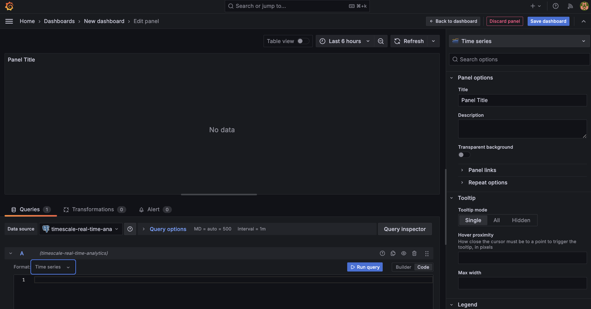
Queriessection, selectCode, then selectTime seriesinFormat. -
Select the data range for your visualization:
the data set is from 2016. Click the date range above the panel and set:
- From:
2016-01-01 01:00:00 - To:
2016-01-30 01:00:00
- From:
-
On the
-
Combine and Grafana functionality to analyze your data
Combine a time_bucket, with the Grafana
$__timefilter()function to set thepickup_datetimecolumn as the filtering range for your visualizations.This query groups the results by day and orders them by time.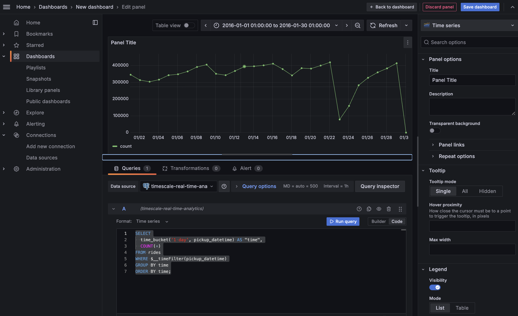
-
Click
Save dashboard
Optimize revenue potential
Having all this data is great but how do you use it? Monitoring data is useful to check what has happened, but how can you analyse this information to your advantage? This section explains how to create a visualization that shows how you can maximize potential revenue.Set up your data for geospatial queries
To add geospatial analysis to your ride count visualization, you need geospatial data to work out which trips originated where. As is compatible with all extensions, use PostGIS to slice data by time and location.-
Connect to your and add the PostGIS extension:
-
Add geometry columns for pick up and drop off locations:
-
Convert the latitude and longitude points into geometry coordinates that work with PostGIS.
First, set the decompression limit to avoid errors when updating large amounts of data:
Then run the UPDATE to convert coordinates:This updates 10,906,860 rows of data on both columns, it takes a while. Coffee is your friend.
Visualize the area where you can make the most money
In this section you visualize a query that returns longer rides (greater than 5 miles) within 2 km of Times Square. By filtering for longer trips and visualizing pickup locations, you can identify the areas where a taxi driver is most likely to pick up a passenger who wants a longer ride, and make more money.-
Create a geolocation dashboard
-
In Grafana, from the
Dashboardspage, clickNewand selectNew dashboard. -
Click
Add visualization, then select the data source that connects to your and theGeomapvisualization type in the top right. -
In the
Queriessection, selectCodeand change theFormattoTime series.
-
To find longer rides (over 5 miles) within 2 km of Times Square, paste the following query:
You see a world map with a dot on New York.
- Zoom into your map to see the visualization clearly.
-
In Grafana, from the
-
Customize the visualization
-
In the Geomap options, under
Map Layers, click+ Add layerand selectHeatmap. -
Zoom into your map.
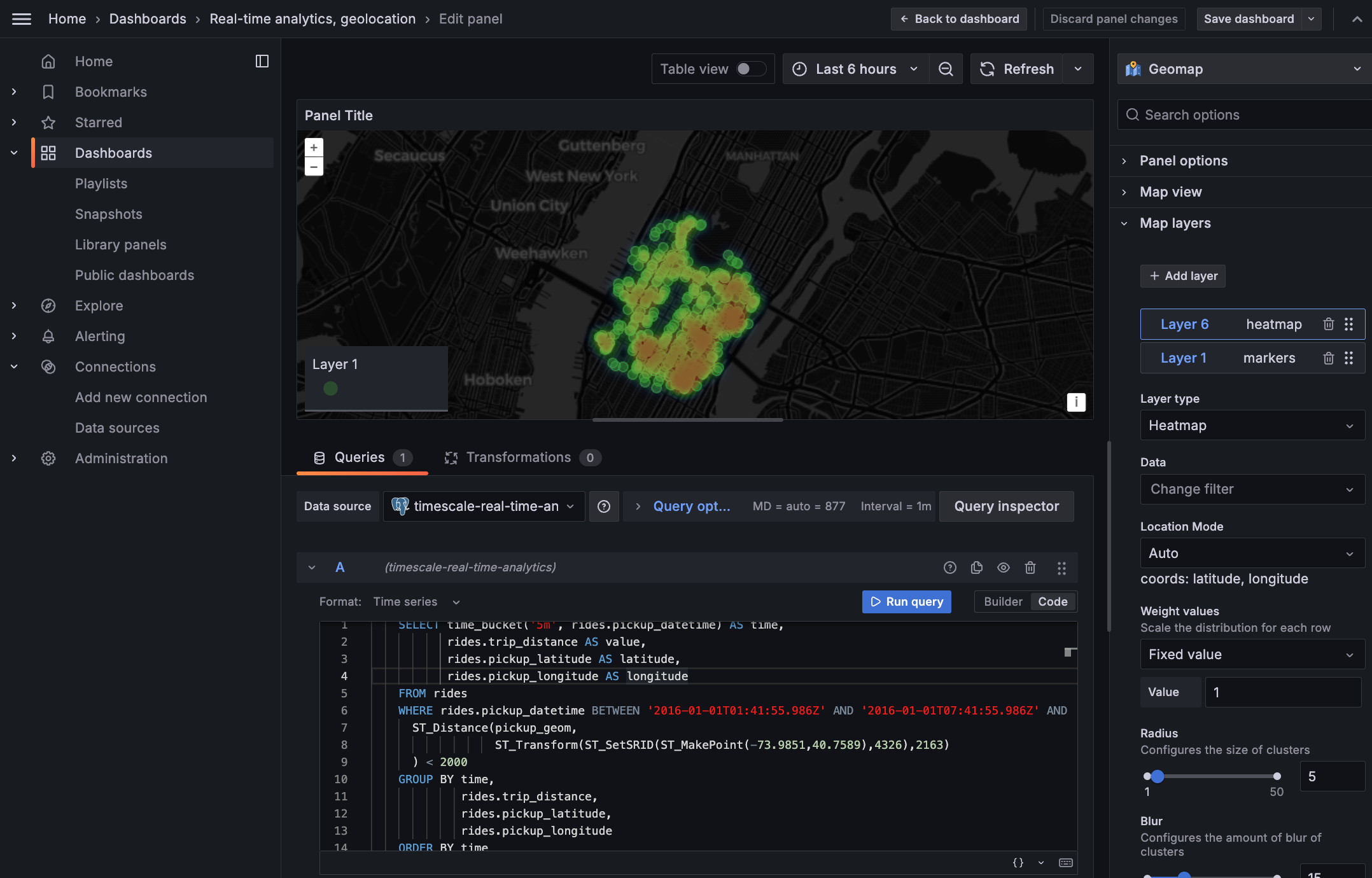
The heatmap now shows the pickup locations for longer rides (over 5 miles) near Times Square.
The areas with higher heat intensity indicate where taxi drivers are most likely to pick up
passengers who want longer rides, helping them make more money.
-
In the Geomap options, under